Section 1 - Windows Compliance Standards
1.1. Application
1.2. For Each Window in the Application
1.3. Text Boxes
1.4. Option (Radio buttons)
1.5. Check Boxes
1.6. Command Buttons
1.7. Drop Down List Boxes
1.8. Combo Boxes
1.9. List BoxesSection 2 - Tester's Screen Validation Checklist
2.1. Aesthetic Conditions
2.2. Validation Conditions
2.3. Navigation Conditions
2.4. Usability Conditions
2.5. Data Integrity Conditions
2.6. Modes (Editable Read-only) Conditions
2.7. General Conditions
2.8. Specific Field Tests
2.8.1. Date Field Checks
2.8.2. Numeric Fields
2.8.3. Alpha Field Checks Section 3 - Validation Testing - Standard Actions
3.1. On every Screen
3.2. Shortcut keys / Hot Keys
3.3. Control Shortcut Keys 1. Windows Compliance Testing
For Each Application
Start the application by double clicking on its icon. The loading message should show the application name, version number, and a bigger pictorial representation of the icon.
No login is necessary.
The main window of the application should have the same caption as the caption of the icon in Program Manager.
Closing the application should result in an "Are you Sure" message box.
Attempt to start application twice. This should not be allowed - you should be returned to main Window.
Try to start the application twice as it is loading.
On each window, if the application is busy, then the hour glass should be displayed. If there is no hour glass (e.g. alpha access enquiries) then some enquiry in progress message should be displayed.
All screens should have a Help button, F1 should work doing the same.
For Each Window in the Application
If the window has a minimize button, click it.

The window should return to an icon on the bottom of the screen.
This icon should correspond to the original icon under Program Manager.
Double click the icon to return the window to its original size.
The window caption for every application should have the name of the application and the window name - especially the error messages. These should be checked for spelling, English and clarity, especially on the top of the screen. Check if the title of the window does make sense.
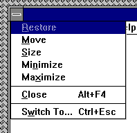
If the screen has a control menu, then use all ungreyed options. (see below)

Check all text on window for spelling/tense and grammar
Use TAB to move focus around the window.
Use SHIFT+TAB to move focus backwards.
Tab order should be left to right, and up to down within a group box on the screen. All controls should get focus - indicated by dotted box, or cursor. Tabbing to an entry field with text in it should highlight the entire text in the field.
The text in the micro help line should change. Check for spelling, clarity and non-updateable etc.
If a field is disabled (greyed) then it should not get focus. It should not be possible to select it with either the mouse or by using TAB. Try this for every greyed control.
Never updateable fields should be displayed with black text on a grey background with a black label.
All text should be left-justified, followed by a colon tight to it.
In a field that may or may not be updateable, the label text and contents changes from black to grey depending on the current status.
List boxes are always white background with black text whether they are disabled or not. All others are grey.
In general, do not use goto screens, use gosub, i.e. if a button causes another screen to be displayed, the screen should not hide the first screen.
When returning, return to the first screen cleanly i.e. no other screens/applications should appear.
In general, double-clicking is not essential. In general, everything can be done using both the mouse and the keyboard.
All tab buttons should have a distinct letter.
Text Boxes
Program Filename:
Move the mouse cursor over all enterable text boxes. The cursor should change from arrow to insert bar. If it doesn't then the text in the box should be grey or non-updateable.
Enter text into the box
Try to overflow the text by typing to many characters - should be stopped Check the field width with capitals W.
Enter invalid characters - Letters in amount fields, try strange characters like + , - * etc. in All fields.
SHIFT and arrow should select characters. Selection should also be possible with mouse. Double click should select all text in box.
Option (Radio Buttons)

The left and right arrows should move 'ON' selection. So should up and down. Select with the mouse by clicking.
Check Boxes

Clicking with the mouse on the box, or on the text should SET/UNSET the box. SPACE should do the same.
Command Buttons

If the command button leads to another screen, and if the user can enter or change details on the other screen, then the text on the button should be followed by three dots.
All buttons except for OK and Cancel should have a letter access to them. This is indicated by a letter underlined in the button text. The button should be activated by pressing ALT+letter. Make sure that there is no duplication.
Click each button once with the mouse - This should activate
Tab to each button - Press SPACE - This should activate
Tab to each button - Press RETURN - This should activate
The above are VERY IMPORTANT, and should be done for EVERY command button.
Tab to another type of control (not a command button). One button on the screen should be default (indicated by a thick black border). Pressing the return key: in ANY CASE no command button control should activate it.
If there is a Cancel button on the screen, then pressing should activate it.
If pressing the command button results in uncorrectable data e.g. closing an action step, there should be a message phrased positively with Yes/No answers where Yes results in the completion of the action.
Drop Down List Boxes

Pressing the arrow should give list of options. This list may be scrollable. You should not be able to type text in the box.
Pressing a letter should bring you to the first item in the list with that start with that letter. Pressing 'Ctrl - F4' should open/dropdown the list box.
Spacing should be compatible with the existing windows spacing (word etc.). Items should be in alphabetical order with the exception ofblank/none which is at the top or the bottom of the list box.
Drop down with the item selected should be display the list with the selected item on the top.
Make sure that only one space appears, you shouldn't have a blank line at the bottom.
Combo Boxes

Should allow text to be entered. Clicking the arrow should allow user to choose from list
List Boxes

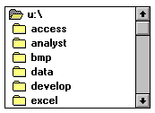
Should allow a single selection to be chosen, by clicking with the mouse, or using the up and down arrow keys.
Pressing a letter should take you to the first item in the list starting with that letter.
If there is a 'View' or 'Open' button beside the list box then double clicking on a line in the list box, should act in the same way as selecting and item in the list box, then clicking the command button.

